AI: what actually works. Applied AI for people who build and sell real things, from a decade of putting tech to work.
By Ev Garde · v5.0 · October 2026
11
Sections
2
Themes
3
Fonts
01
Positioning & Identity
Positioning statement
AI Bear is where a tech professional with 10+ years of enterprise digital experience shares what actually works in AI: from inside the industry, not the sideline. Not news curation. Not hype. A decade of putting tech to work.
Who Writes It
Technology professional
10+ years in SaaS, digital services, IoT and data-driven operations.
AI practitioner
Personally experimenting with AI tools, agents, and product development. Sharing lessons from the intersection of enterprise reality and AI capability.
What It Is Not
Not an academic or researcher
Not publishing papers. Not aggregating AI news.
Visual Concept: Forge
Where raw material becomes something useful. Workshop warmth meets digital sharpness. The palette channels metalworking, the maker space, the workshop where materials get shaped into tools. Warm metallics: copper, steel, dark leather. More Leica than blacksmith.
The industrial reference comes through material metaphors, not signage or literal imagery. Serious tools for serious work, with craft and warmth. Like a good power tool: built to last.
Three Words
Crafted
Every piece of content is forged with care. The claw-scratch maker's mark on every component says "handmade by someone who cares about quality."
Warm
Copper accents, ember glows, warm neutrals. This brand has depth: not the brightness of plastic, but the heat of metal. Approachable without being casual.
Substantial
Two-layer shadows. Brushed metal textures. Thick badge borders with inner glow. Components feel like physical objects, not web elements.
02
Voice
Tone Dimensions
Formal ↔ Conversational
Serious ↔ Playful
Technical ↔ Accessible
Voice Character
Direct
Conclusions first, then explain. No throat-clearing.
Evidence-led
Every claim carries proof. Numbers, examples, tested results.
Peer-level
Fellow professionals, not students. Respect the reader's time.
Measured
Selectivity is the brand promise. No firehose of tips.
Wry
Dry observation, never sarcasm. The hazard stripe is the visual wink.
What the Voice is NOT
Not motivational
Informs, doesn't inspire. No rallying cries or life-changing promises.
Not alarmist
No catastrophising for clicks. "AI will replace you" is not our game.
Not self-deprecating
Confident without arrogance. No "I'm just a random guy" energy.
Not academic
Rigour without footnotes. We cite, but we don't lecture.
Not salesy
When selling, say so directly. No disguised pitches.
Platform Calibration
Platform
Adjustment
LinkedIn article
Full voice. Evidence-dense. Clear structure.
LinkedIn post
Tighter. One insight. Short paragraphs. Hook in line 1-2.
Newsletter
Warmest version. Slightly more personal. Can include asides.
Instagram carousel
Visual-first. Headline + 1-2 sentences max per slide. Let the design carry the point.
03
Colour System
Core Palette
Forge Dark
#1C1917
Elevated
#252220
Soot Black
#121010
Parchment
#F5F2E8
Card
#FFFFFF
Copper
#D97706
Spark
#F59E0B
Brushed Steel
#78716C
Emerald
#059669
Emerald Light
#34D399
Forge Red
#CC3300
Forge Red Light
#E84830
Warm White
#E7E5E4
Soot
#57534E
Ash
#A8A29E
Copper Scale
#FFFBEB
#FEF3C7
#FDE68A
#FCD34D
#FBBF24
#F59E0B
#D97706
#B45309
#92400E
#78350F
#451A03
50100200300400500600700800900950
Stone Scale (Neutrals)
#FAFAF9
#F5F5F4
#E7E5E4
#D6D3D1
#A8A29E
#78716C
#57534E
#44403C
#292524
#1C1917
#0C0A09
50100200300400500600700800900950
Colour Roles
Role
Light Mode
Dark Mode
Notes
Page bg
#F5F2E8 Parchment
#121010 Soot Black
Default surface
Section bg
n/a
#1C1917 Forge Dark
Section panels on dark theme
Card bg
#FFFFFF
#252220 Elevated
Raised surface
Primary accent
#D97706 Copper
#D97706 Copper
Logo, accents, section numbers
Hover accent
#B45309
#F59E0B Spark
Interactive highlight
Primary text
#1C1917 Forge Dark
#E7E5E4 Warm White
Headlines, body
Secondary text
#57534E Soot
rgba(231,229,228,0.65)
Body, descriptions
Tertiary text
#A8A29E Ash
rgba(231,229,228,0.40)
Meta, timestamps
Accent text on light
#92400E
n/a
NEVER use raw Copper as text on light
Success
#059669 Emerald
#34D399
Use light variant on dark bg
Danger
#CC3300 Forge Red
#E84830
Use light variant on dark bg
Borders
rgba(28,25,23,0.06)
rgba(231,229,228,0.06)
Default card/component borders
Contrast Rules
WCAG AA minimum (4.5:1 normal text, 3:1 large text). Tested values for the Forge palette.
Combination
Ratio
Verdict
Forge Dark on Parchment
14.8:1
AAA
Warm White on Soot Black
15.2:1
AAA
Copper on Soot Black
7.1:1
AAA
Soot on Parchment
6.5:1
AA
Copper on Parchment
1.9:1
FAIL: never use
Copper-Light (#92400E) on Parchment
6.1:1
AA Use this instead
Forge Red Light on Soot Black
4.6:1
AA
Emerald Light on Soot Black
9.5:1
AAA
Data Visualisation Palette
Categorical colours for charts. Use in order. For 2-3 series, use only the first 2-3.
Copper
Emerald
Cobalt
Spark
Violet
Teal
Rose
Steel
Accent Usage Rules
Copper is the primary accent: logo, section numbers, card accent borders, progress bars, nav highlights. Emerald is for tags, badges, and status labels. Ratio: ~60% copper accents, ~40% emerald tags across any given page. Forge Red serves as the error and destructive colour, always paired with an icon or label for clarity.
04
Typography
Use
Font
Weight
Size
Headlines
Space Grotesk
700 Bold
28-96px
Body text
Inter
400 Regular / 600 Semi
14-18px
Code / data / labels
JetBrains Mono
400 Regular / 500 Medium
11-13px
Label rules: JetBrains Mono labels use letter-spacing: 0.08em max, uppercase. Minimum font size for accessible labels: 11px.
05
Themes
Two official themes. Dark is the default for every image we publish: article visuals, social posts, carousels and covers. Light is for long reading: documents, guides and web pages. Use the toggle (top-right) to preview.
Light Theme: Grain
Default surface
Parchment #F5F2E8 with Brushed Metal Grain (horizontal lines at 3% opacity). Warm off-white with an amber lean and subtle industrial texture. Cards are pure white #FFFFFF. Text is Forge Dark #1C1917.
Fallback: When CSS background patterns are unavailable (print, email, PDF export), use flat Parchment #F5F2E8 without the grain texture.
Dark Theme: Soot Black
Dark surface
Soot Black #121010 page background. Warm near-black. Cards on Forge Elevated #252220. Text in Warm White #E7E5E4.
Theme Colour Mapping
Element
Light (Grain)
Dark (Soot Black)
Page bg
#F5F2E8 + grain texture
#121010 Soot Black
Card bg
#FFFFFF
#252220 Elevated
Primary text
#1C1917
#E7E5E4
Secondary text
#57534E Soot
rgba(231,229,228,0.65)
Tertiary text
#A8A29E Ash
rgba(231,229,228,0.40)
Accent
#D97706 Copper
#D97706 Copper (same)
Accent text
#92400E (dark copper)
#D97706 Copper
Success text
#059669 Emerald
#34D399 Emerald Light
Danger text
#CC3300 Forge Red
#E84830 Forge Red Light
Borders
rgba(28,25,23, 0.06)
rgba(231,229,228, 0.06)
Nav bg
#FFFFFF
#1C1917 Forge Dark
When to Use Each Theme
Light (reading)
Article body content
Guides and worksheets
Documents and reports
Website pages
Email templates
Dark (images)
Article images and covers
Hero sections and banners
Social media carousels
Presentation title slides
LinkedIn profile banner
Dashboard headers
06
Patterns & Textures
Nine surfaces and patterns available. Use 1-2 patterns per view. Never stack more than 2 in one viewport. All adapted to Forge copper tones. Toggle Dark Mode (top-right) to preview the dark theme.
Brushed Metal Grain
Default dark surface. Horizontal lines at 3-4% opacity.
Ember Glow
Radial gradient from bottom. Hero sections, high-impact.
Hazard Grid
Diagonal copper stripes at 4% opacity.
Full Hazard Stripe
Bold diagonal copper/dark. Use sparingly.
Hazard Bar
Optional top-of-element stripe. Faded at edges. 4px height.
Blueprint Grid
Copper-tinted grid. 120px/40px.
Margin Stripe
Right-edge annotation. 16px wide.
Parchment
Default light surface. Clean, warm. No visible texture.
Soot Black
Dark theme page bg. Warm near-black. #121010.
Pattern Usage Guide
Pattern
Surface
Use for
Max per view
Brushed Metal
Dark
Default dark background, cards, sections
Always-on for dark
Ember Glow
Dark
Hero sections, social image backgrounds
1 per page
Hazard Grid
Dark
Alternative dark bg. More industrial feel.
1 section
Full Hazard Stripe
Any
Background for accent tags, contained elements only
Sparingly
Hazard Bar
Any
Optional element. Top of hero, articles, cards. Faded edges.
The hazard bar is a 4px alternating copper/dark stripe at the top of elements. It fades at both edges via CSS mask. Add it to any dark element (hero, article header, card, banner) for an industrial touch. It is always optional: the design works without it. When present, it adds a subtle "under construction" signal.
Example:
An element with the hazard bar on top
The bar fades at both edges. 4px height. Copper and Forge Dark alternating.
Three curved claw-scratch arcs in a rounded-square container. Each arc bows right. The right scratch is shortest, the middle is longest. Two primary treatments, light context and dark context, form the core pair. The files are under Downloads below.
Primary Pair
Light Context
Copper + Dark LinkedIn · email · newsletter
Dark Context
Dark + Copper Podcast · dark mode · decks
Monochrome
Dark + Warm White Print · single-colour
Accent
Dark + Red Events · keynotes
Logo Spec
ViewBox: 0 0 240 240. Container: rx="40". Three arcs: right (sw 17, shortest), middle (sw 20, longest), left (sw 18, medium). Flat gradients, no texture, no shadow. Use stroke-linecap="round" on all arcs.
On Images: the Copper Claw Lockup
On dark images the mark drops its container. The copper claw sits bottom-left beside the wordmark, AI in Warm White and Bear in Copper, with ai-bear.io bottom-right on square posts.
White on Parchment. 3px solid Copper top-accent. Maker's mark claw scratch in top-left at 6% opacity.
Dark Card: Solid
Elevated surface on Forge Dark. 3px solid Copper top-accent. Inner glow on hover.
Note: The hazard bar works on dark containers (article heroes, banners, dark sections) but not on card tops: the copper/dark stripe pattern clashes with light card surfaces. Use the solid copper line for cards.
Article Preview
With optional hazard bar and margin stripe.
The Three-Layer Problem with Enterprise AI
Every enterprise AI deployment I've seen fail had the same root cause: the integration layer, where AI meets the systems already there, was treated as an afterthought.
Insight: The teams that succeed treat integration as a first-class architecture concern, not a deployment task.
After watching this pattern repeat across construction, manufacturing, and logistics, the fix became obvious: you build the integration layer first, then fit the model to it.
09
Gradients & Effects
Forge Depth
Hero sections
Copper Glow
CTA buttons, progress
Dark Vignette
Photo overlays
Parchment Fade
Section transitions
Copper-to-Forge
Bold accent, sparingly
Image Overlay Recipes
Recipe
Treatment
Use for
Dark screen
Forge Dark @ 75% opacity, multiply blend
Social images with text
Light wash
Parchment @ 25% opacity
Inline article photos
Duotone
Desaturate 100%, Copper blend @ 8%
Headshots, speaker bios
Warm grade
Reduce blues -10%, boost warm tones +5%
All editorial photography
10
Images
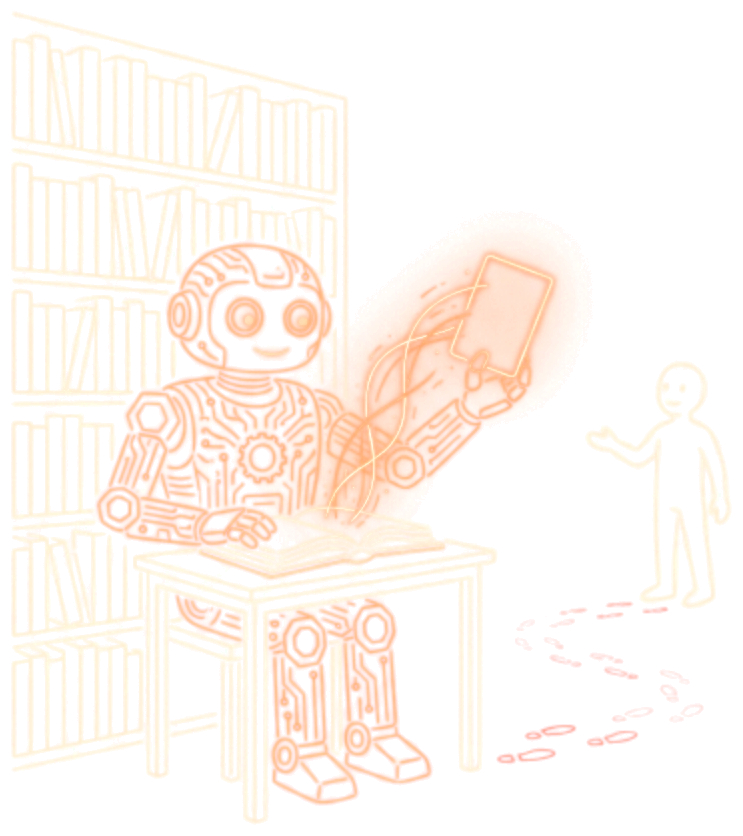
Every image AI Bear publishes, from article covers to carousel slides, is built the same way: real type in the brand fonts on the dark Forge surface, with one illustration made for it and blended into the background.
Zero-click search
The librarian now reads the book for you
AI Bear
A section image from an October 2026 article, rebuilt here in HTML: the type is real text, and the illustration has no box around it.
The Rules
Surface
Forge Dark gradient (#1C1917 to #292524), a faint grid, and one glow per image: copper, emerald or forge red.
Type
Real type in Space Grotesk, Inter and JetBrains Mono, never generated inside a picture. No serif, and nothing under 24px at full size.
Illustration
Flat glowing line-art in Copper, Warm White and a little Forge Red, drawn on black and blended into the surface. One per image, made for it.
Layout
Text on the left, the illustration centred in the space on the right. Line breaks set by hand, never one word alone on a line.
Lockup
Copper claw and wordmark bottom-left, ai-bear.io bottom-right on square posts.
Charts
Bars drawn to true scale with the value outside the bar. A relative number is shown as a comparison, never on its own.
Formats
Use
Size
Notes
Article cover
1200 × 630
Also the link preview and the email cover
LinkedIn post
1200 × 1500
The cover recomposed at 4:5
Section image
1080 × 1080
One per section that earns it
Photos and Screenshots
Photos come only from sources that allow reuse (Unsplash, Pexels, Wikimedia Commons, press kits, or our own), with a small credit. Screenshots of other people's pages get a thin frame and a credit line. Our own screenshots go in as they are.
11
Usage Rules
Colour Rules
Do
Use Copper as fills, borders, backgrounds, and decorative accents
Use #92400E for amber-toned text on light surfaces
Use Forge Red Light #E84830 for danger text on dark surfaces
Use Emerald Light #34D399 for success text on dark surfaces
Use Spark #F59E0B for hover states on dark surfaces
Don't
NEVER use Copper #D97706 as text on light surfaces (1.91:1, fails WCAG)
Don't use Forge Red #CC3300 as body text on dark (3.63:1, fails)
Don't use Ash as text on light surfaces (2.20:1, fails)
Don't mix cool greys (slate blue) with the warm palette
Don't use more than 2 hazard stripe elements in one viewport
Pattern Rules
Do
Use Brushed Metal as the default dark surface texture
Use Ember Glow for hero sections and high-impact moments
Use Blueprint Grid for technical/data content
Add Hazard Bar optionally to any dark element for industrial flavour
Keep Parchment surfaces clean, with no visible texture
Don't
Don't stack more than 2 patterns in one viewport
Don't use Full Hazard Stripe as a background, only for contained accents (tags, small elements)
Don't put Hazard Grid and Blueprint Grid in the same view: pick one
Don't use construction language literally ("under construction", hard hat imagery)
Don't apply textures to light surfaces: they look dirty, not industrial
Writing Rules
Do
Use a colon: to introduce an explanation: "The fix: build the integration layer first"
Use a spaced hyphen - for an aside, and a plain hyphen for ranges: "Tested across 10K-10M pages"
Write percentages with the symbol: 30%, never "30 percent"
British English, contracted the way people talk: "it's", "we're", "I've"
Don't
Never use an em dash— or a double hyphen anywhere. It is the #1 AI fingerprint in written content
Don't write "The fix — build the integration layer first"
Don't stack "not X, it's Y" contrasts, or narrate who failed to act ("nobody saw it coming")
Don't open with "Moreover", "Furthermore" or "Additionally", and don't use "delve", "landscape", "leverage" or "realm"
Brand Rules
Do
The construction metaphor is visual, never verbal
Copper is the hero: keep 60%+ copper to 40% other accents
Cards get a maker's mark (single claw scratch, top-left, 6-8% opacity)
Badge borders get inner glow for "heated metal" depth
Dark for every image we publish, light for long reading
Don't
Don't depict bears wearing construction gear
Don't combine hazard stripes with the bear mark in the same composition
Don't use generic AI stock imagery: humanoid robots, glowing brains, blue-purple gradients
Don't use fonts outside the system (Space Grotesk, Inter, JetBrains Mono)
Don't adjust Copper shade: exact #D97706 or it looks cheap